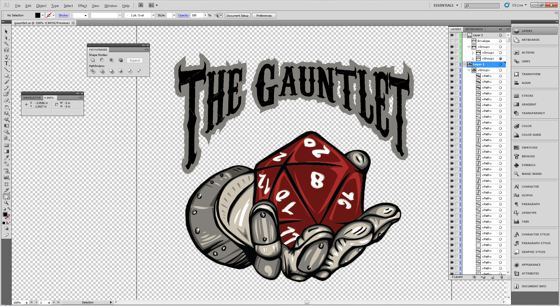
Decided to do some more work on the logo. I cleaned up the outlines, the shading, and added some text. Still hadn’t decided on a style for the numbers (tempted to just leave em alone) and I also feel it needs just a little somethin more… Ideas? Kerry Harrison and Jason Cordova ?
Other than a background it looks ready to roll!
Other than a background it looks ready to roll!
That is really well done!
That is really well done!
Alex Camacho I think it looks great! The letters are satisfyingly Metal, haha. I’m thinking the t-shirts themselves would be light gray (the color of the palm of the gauntlet).
Alex Camacho I think it looks great! The letters are satisfyingly Metal, haha. I’m thinking the t-shirts themselves would be light gray (the color of the palm of the gauntlet).
Alex Camacho I would probably make the letters a little bigger. The numbers on the die are good, except the 12 is kind of weird (maybe just make it a single digit number?).
Alex Camacho I would probably make the letters a little bigger. The numbers on the die are good, except the 12 is kind of weird (maybe just make it a single digit number?).
Needs a picture of me in place of the 8. 🙂
Needs a picture of me in place of the 8. 🙂